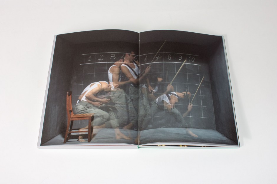
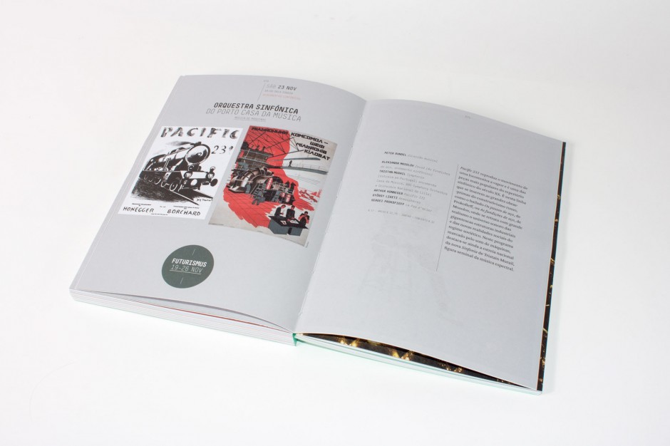
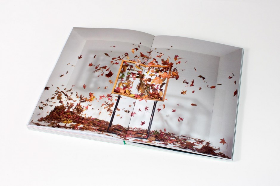
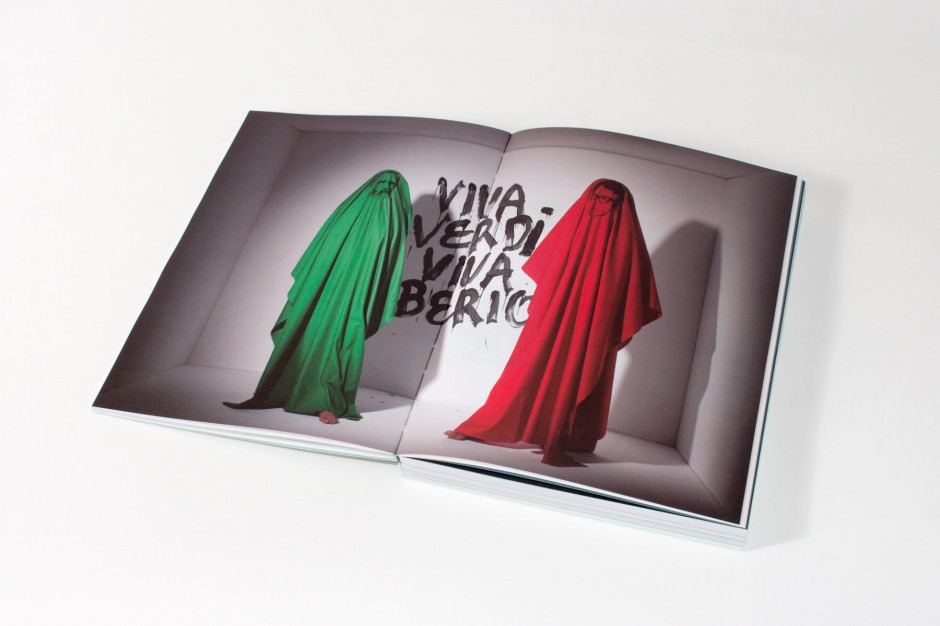
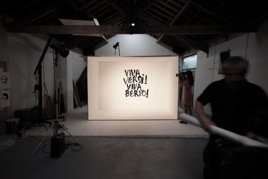
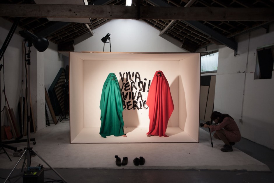
This is the publication that groups the year-long programming, presenting it through the course of 12 narratives (monthly communication anchors), each with its own identity. Drawing inspiration on the theme country’s, Italy, most characteristic iconographies each narrative was photographed as a staged display. Simple, our institutional font, is used along the publication. The colours used on the cover are also present inside separating the programming blocks. The spine enables a better handling of the object as well as a clear view of the entire spreads allowing the images to flow from one page to another. In general, this approach aims to make readability easier given the complexity and density of the contents.
–
Edition with 360 pages
Printed in CMYK + Pantone 3375 U
Cover with UV colored varnish in Munken linx 300gsm
Internal pages in Coral Book White 90gsm
Book spine with pattern
Art direction and graphic design: Sara Westermann
Photography art direction: Sara Westermann and André Cruz
Photography: Pedro Lobo photography studio
Video: Canal 180
–
client: Casa da Música